
Loading

Color Visión is the leading network in the Dominican Republic. The original colour TV network, the channel has maintained a reputation for being the market leader through constant evolution and a desire to be ‘Siempre lo Mejor’ – Always the Best.
To strengthen their position in the market, we set ourselves three key tasks: to consolidate brand attribution, to build distinctiveness, and to engage audiences in a way that only a truly local channel can.
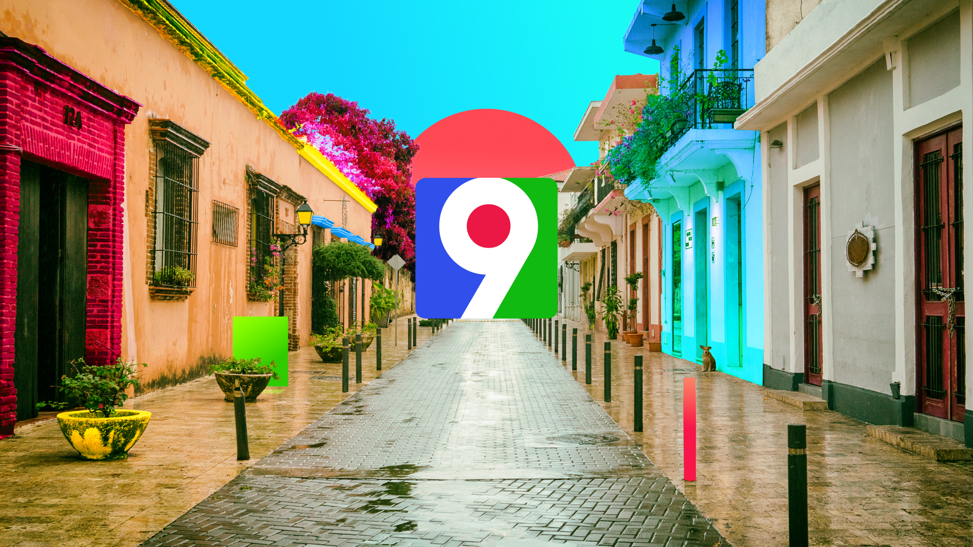
The logo captures the essence of the brand’s heritage – RGB ‘colour vision’. Our creative intention was to stay true to this tri-colour logo, evolving it into a more contemporary marque that can be deconstructed to provide brand elements that form the basis of the visual identity.
Across the graphics toolkit, we used these deconstructed shapes to create a unique brand imprint that allows Color Visión to own the content.
We wanted to honour the brand’s heritage with our ident concept. Each ID takes the brand out into the real world of the Dominican Republic. Selecting a series of locations that would be familiar to Dominicans, we dropped our brand imprints into each scene, bringing them to life with Color Visión’s bold energy and vibrancy.
The team at Color Visión are delighted with the channel’s updated look, and it launched to positive buzz amongst the local Dominican audience.