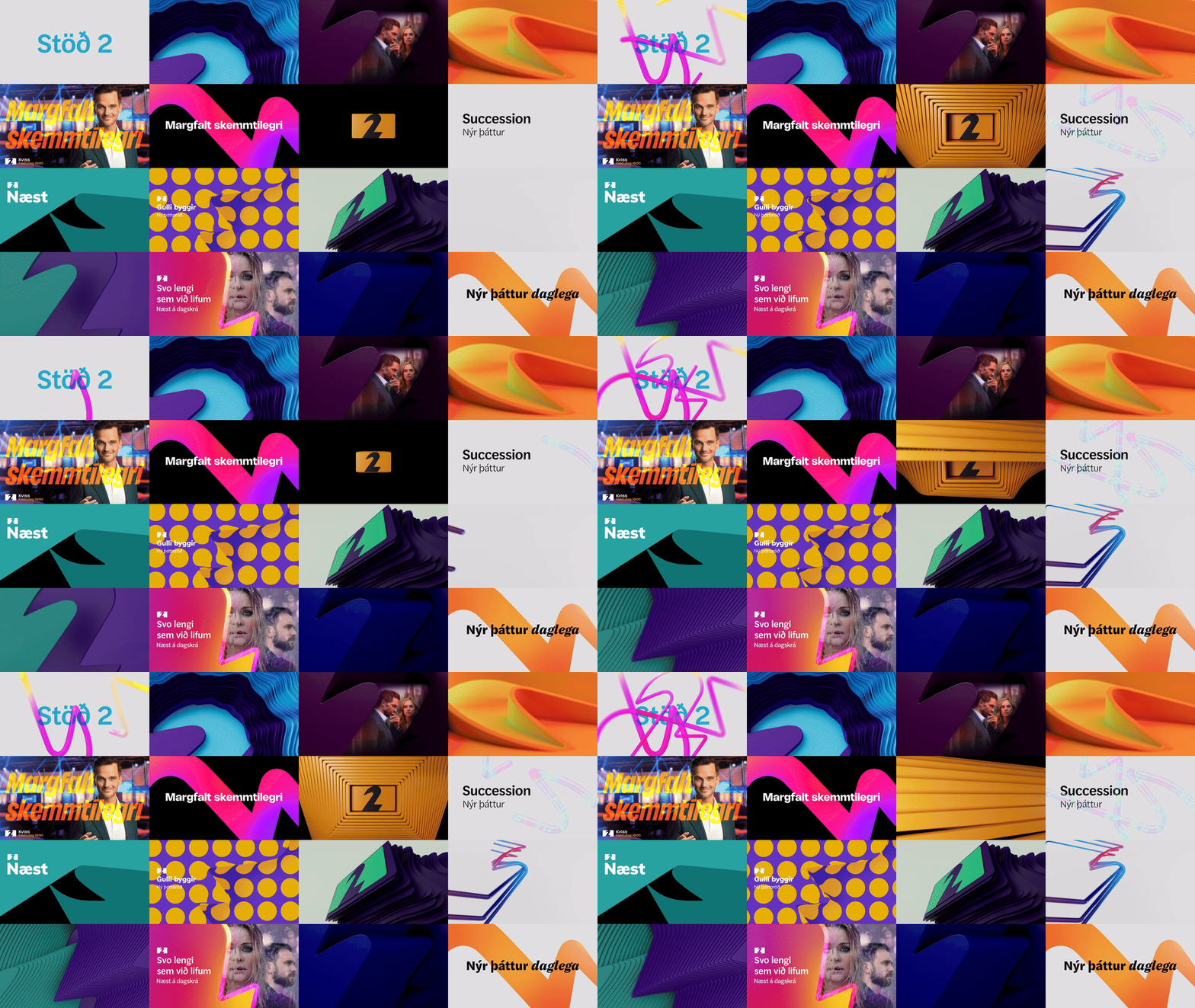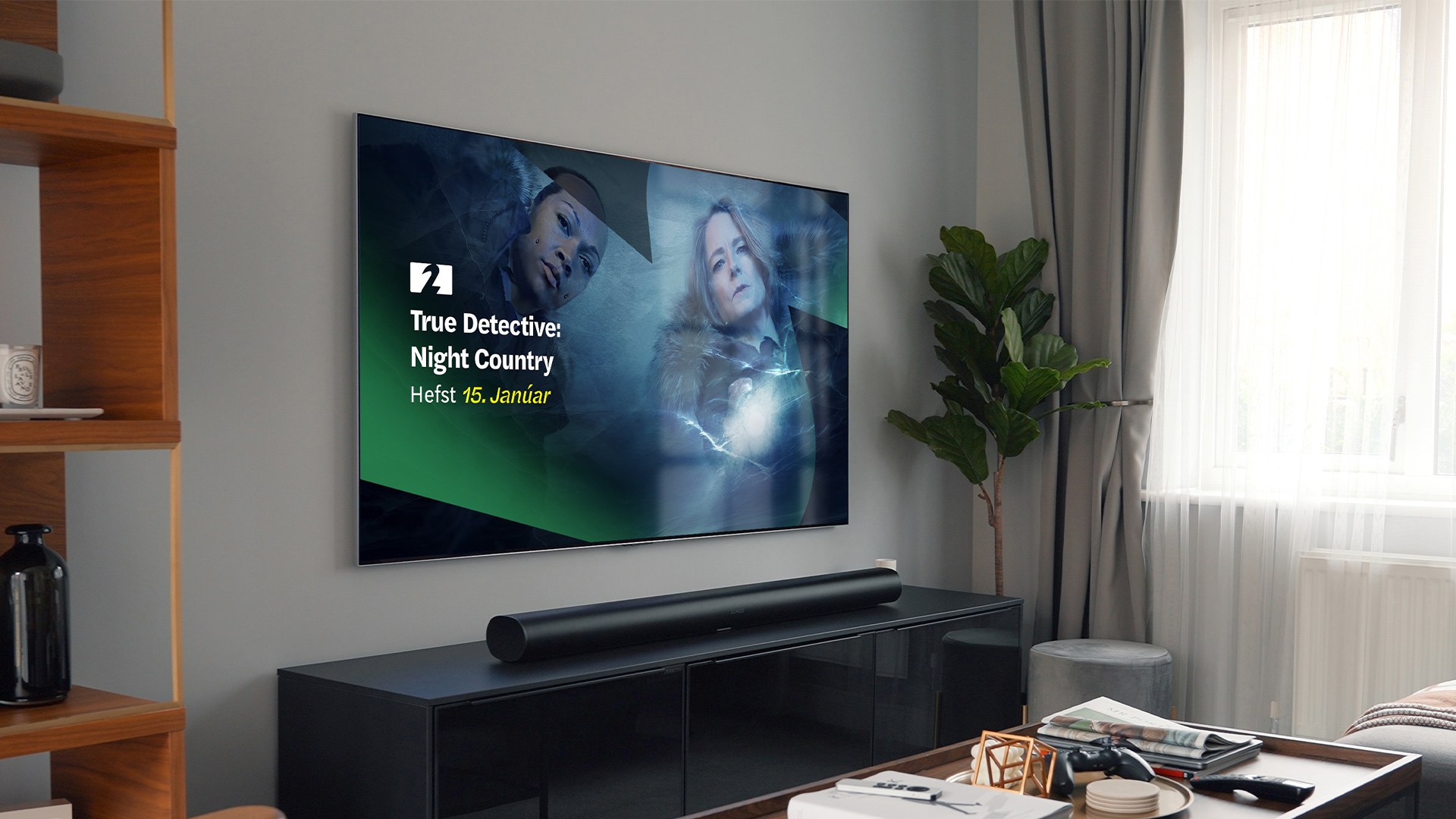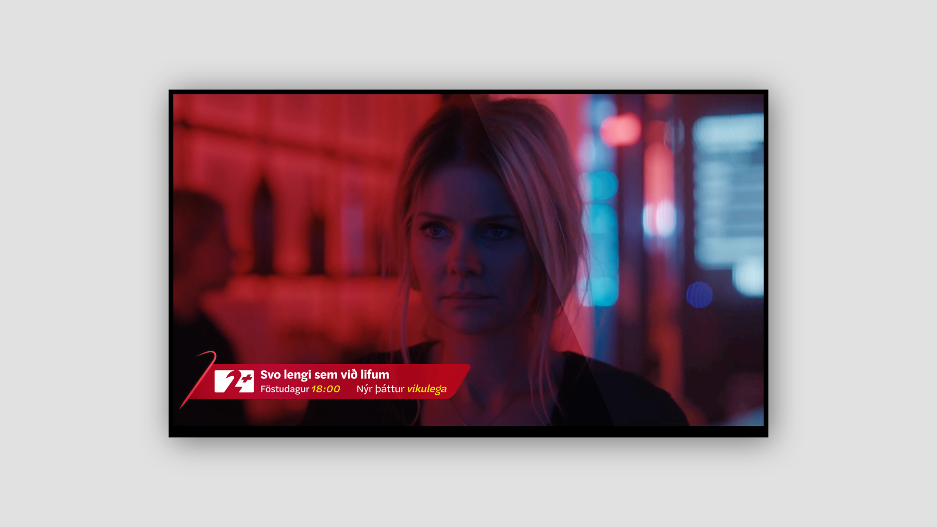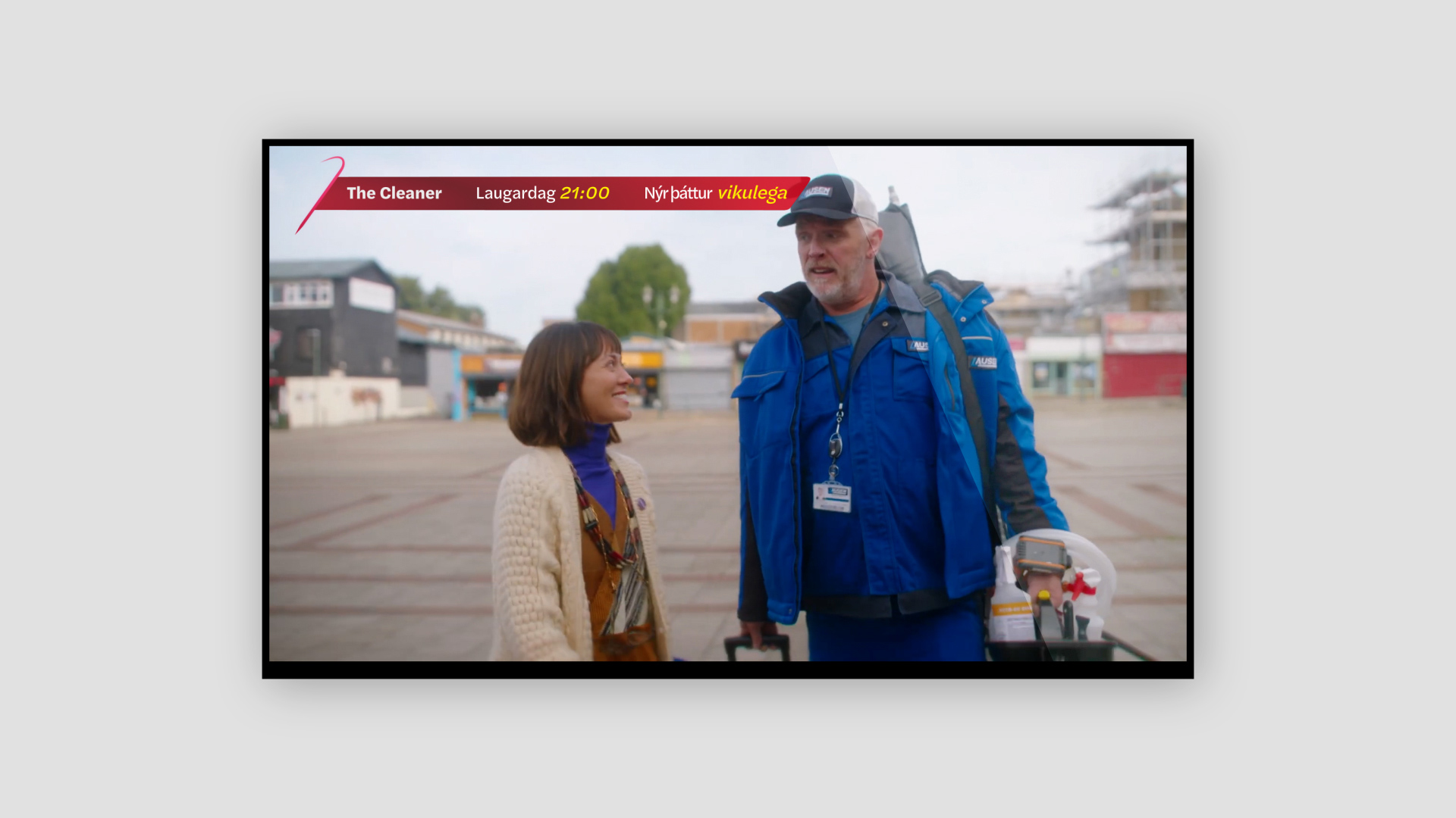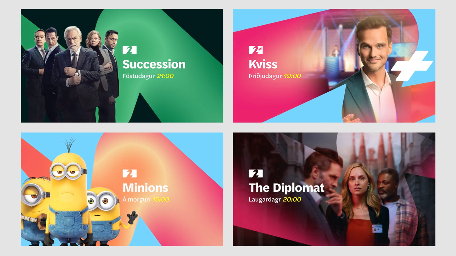
Our task was to update the channel identity to strengthen its position in the market and broaden its reach by targeting a younger demographic drawn to modern, minimal Nordic aesthetics.
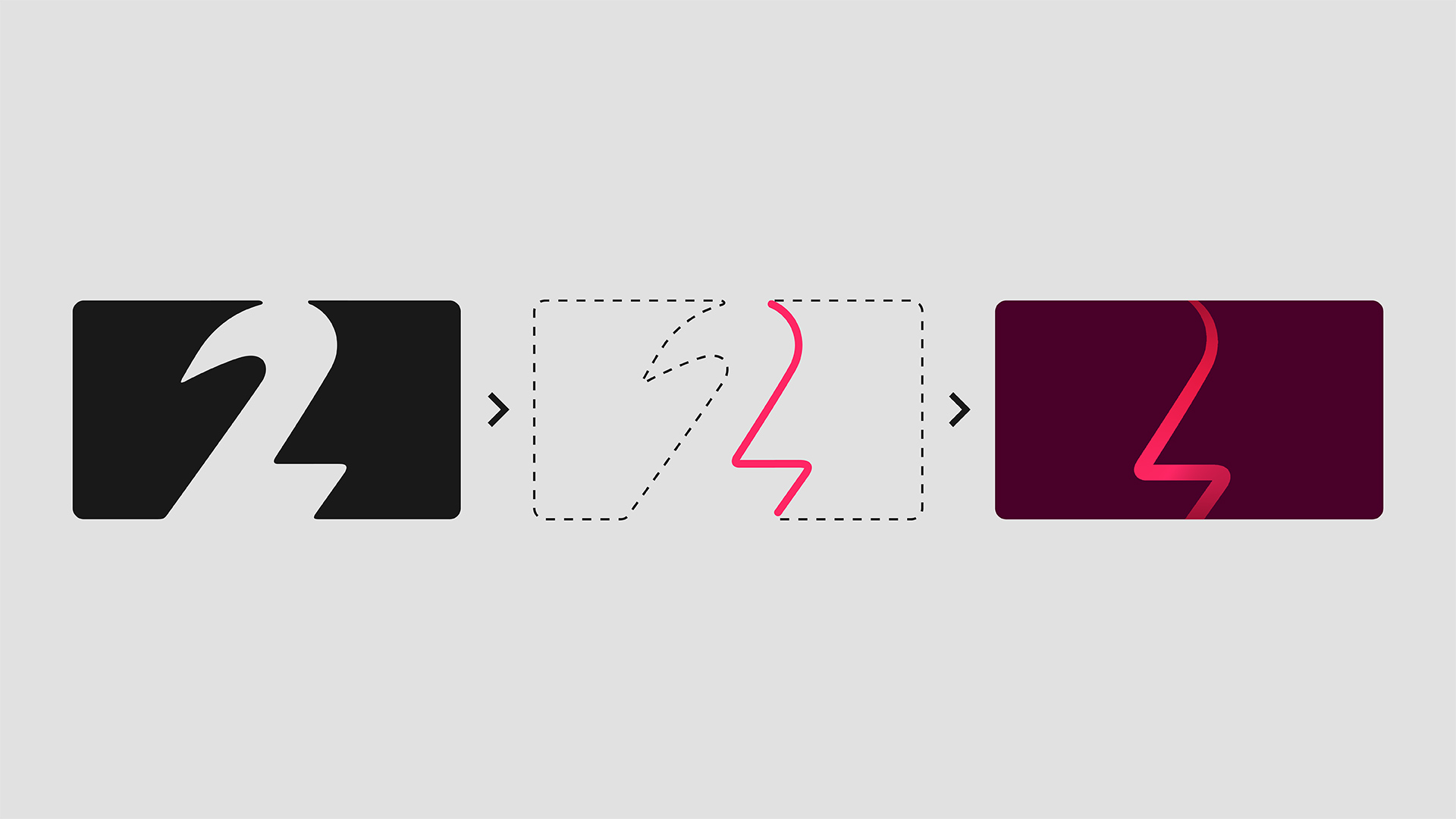
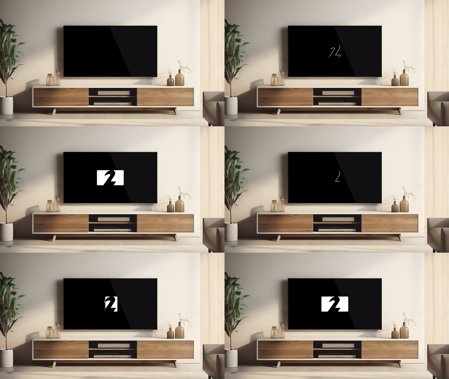
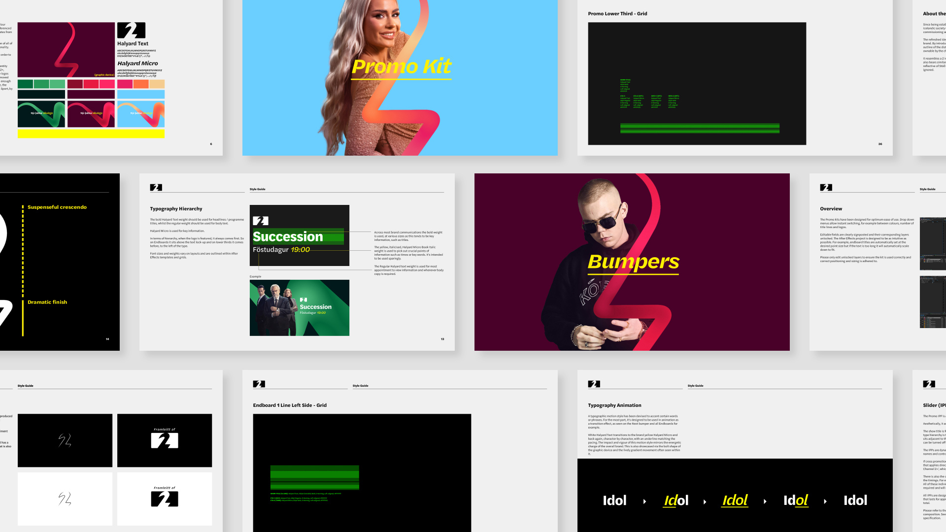
At the heart of the refreshed identity is an energised logo, and a unique brand property that originates from its outline. In isolation it resembles a 2, but also an energy bolt, reflective of Stöð 2’s 100% awareness in the market. It simply can’t be ignored.
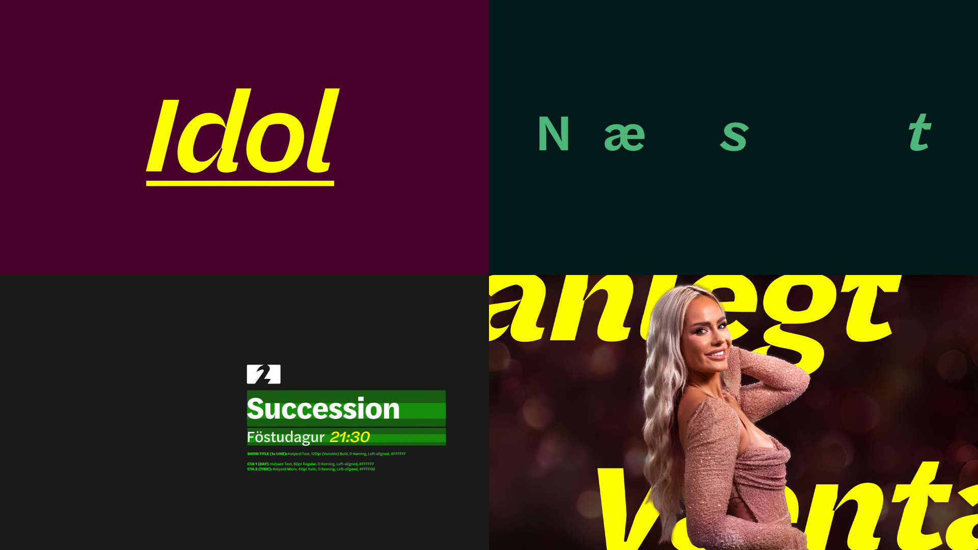
The motion theory follows the form of the graphic device, with a long sweeping curve followed by a sharp flick. A suspenseful crescendo building to a dramatic finish.
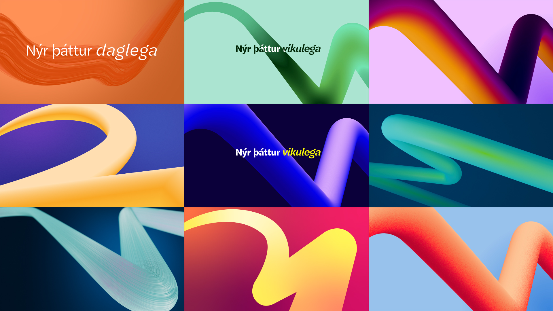
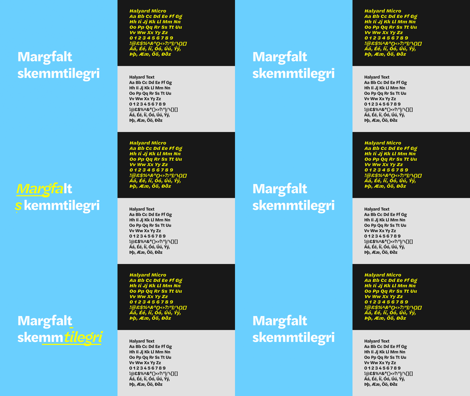
Distinctive typography reflects both the quality and edginess of the channel. It’s functional and effective but can be injected with a sense of fun through a secondary yellow font that’s often used in animation.
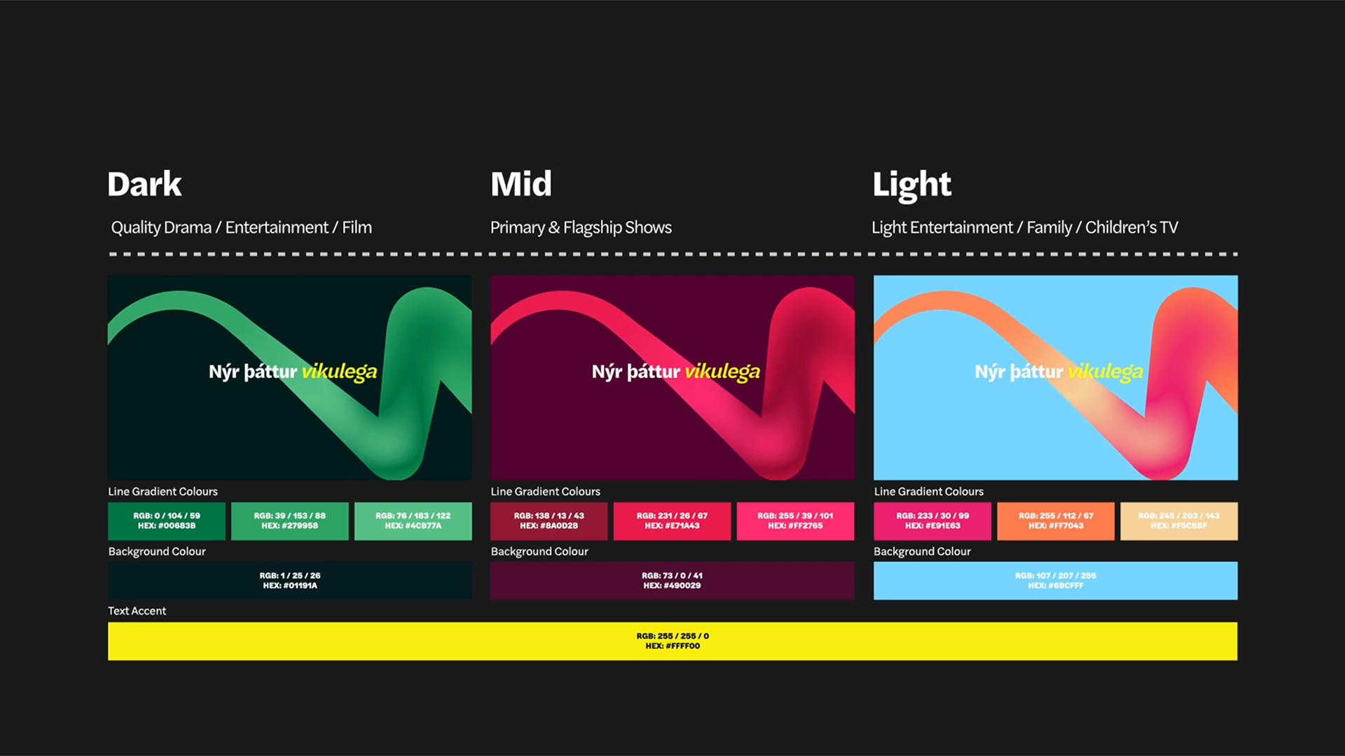
We devised a flexible colour palette to span the breadth of content Stöð 2 boasts, from dark dramas, to flagship entertainment and light family TV.
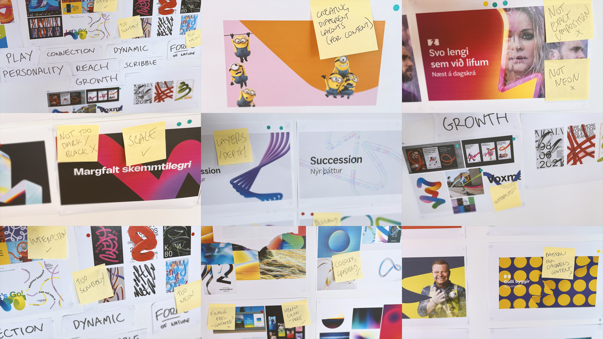
Quality, Fun, Luxurious and Edgy are all key words that Stöð 2 use to describe themselves. The delivered brand identity is fun and edgy, through its bravely minimal and modern approach, its bold use of colour and occasionally quirky typography but exudes a sense of quality and luxury via a flexible but structured design system.
"The experience of working with Red Bee was a truly enlightening and inspirational one. When embarking on a rebranding journey with an established media brand one is inevitably filled with a sense of responsibility towards its loyal subscribers as well staying relevant to future subscribers.
Red Bee embraced the project from start to finish delivering a brand that represents all of Channel 2‘s key elements with a sharp, colourful and energetic outcome."
Thora Clausen, Head of Programming & Acquisitions.

