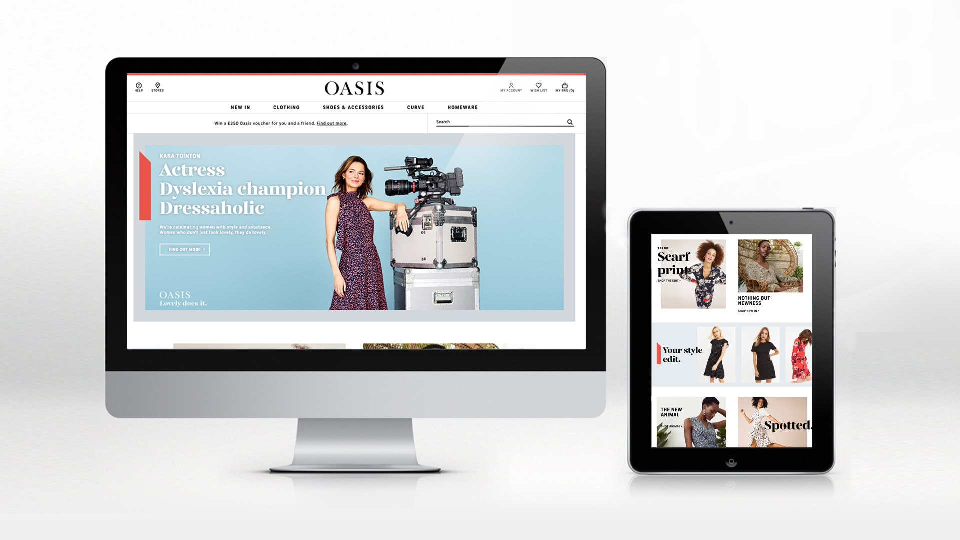
Our challenge was to reinvigorate the Oasis brand and increase its relevance to a new generation of stylish British women.
We were tasked with strategically reinvigorating the Oasis brand to help the retailer to move away from a season-led campaign approach to a more consistent and effective brand-first campaign style. The new approach is part of a strategic overhaul by the client team to extend their brand into new categories and retail environments, with a particular focus on how the Oasis brand operates in digital and social spaces.
The Big Idea
Oasis is different from other too cool, urban fashion brands: its product, shops, service and customers are genuinely lovely. Our task was to re-define what it means to be ‘lovely’ for a new generation. Lovely, with a capital ‘L’, is not twee, cute, or passive. Lovely is a powerful combination of style and substance. The women who wear Oasis don’t just look Lovely in the clothes, they do Lovely while wearing them.
THE LAUNCH CAMPAIGN
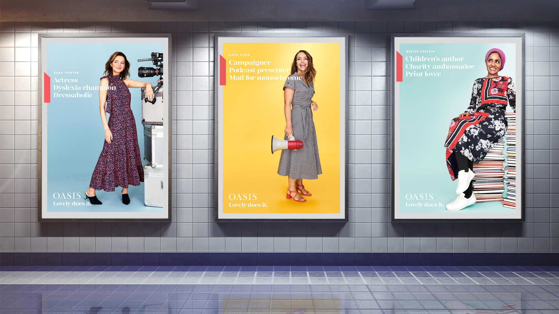
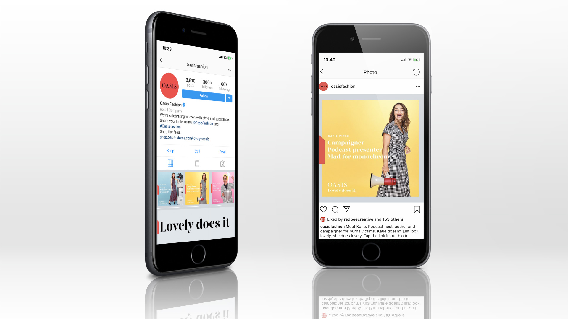
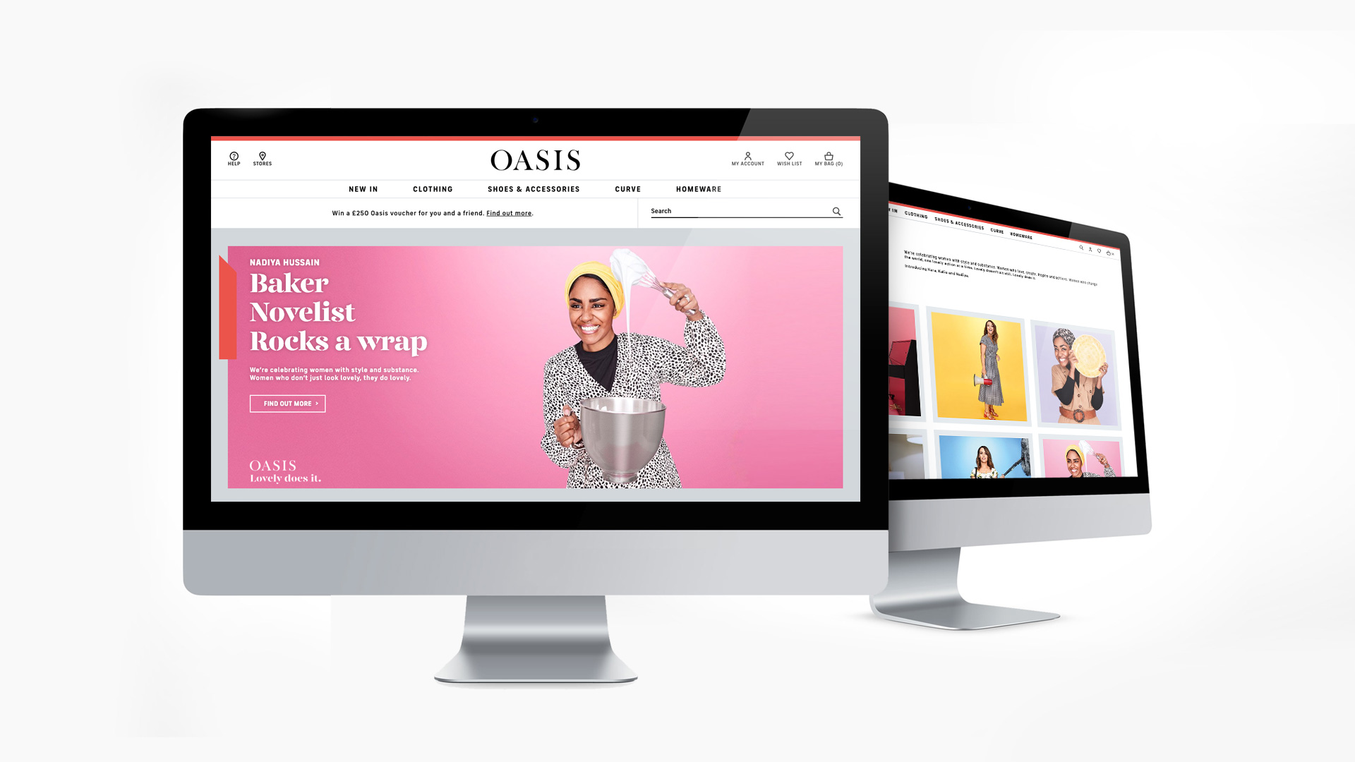
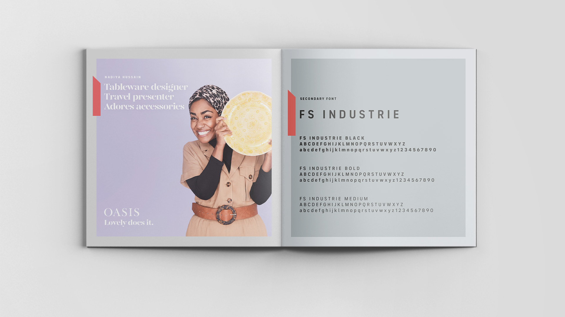
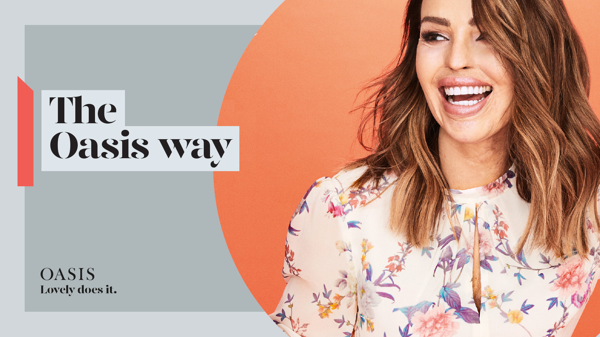
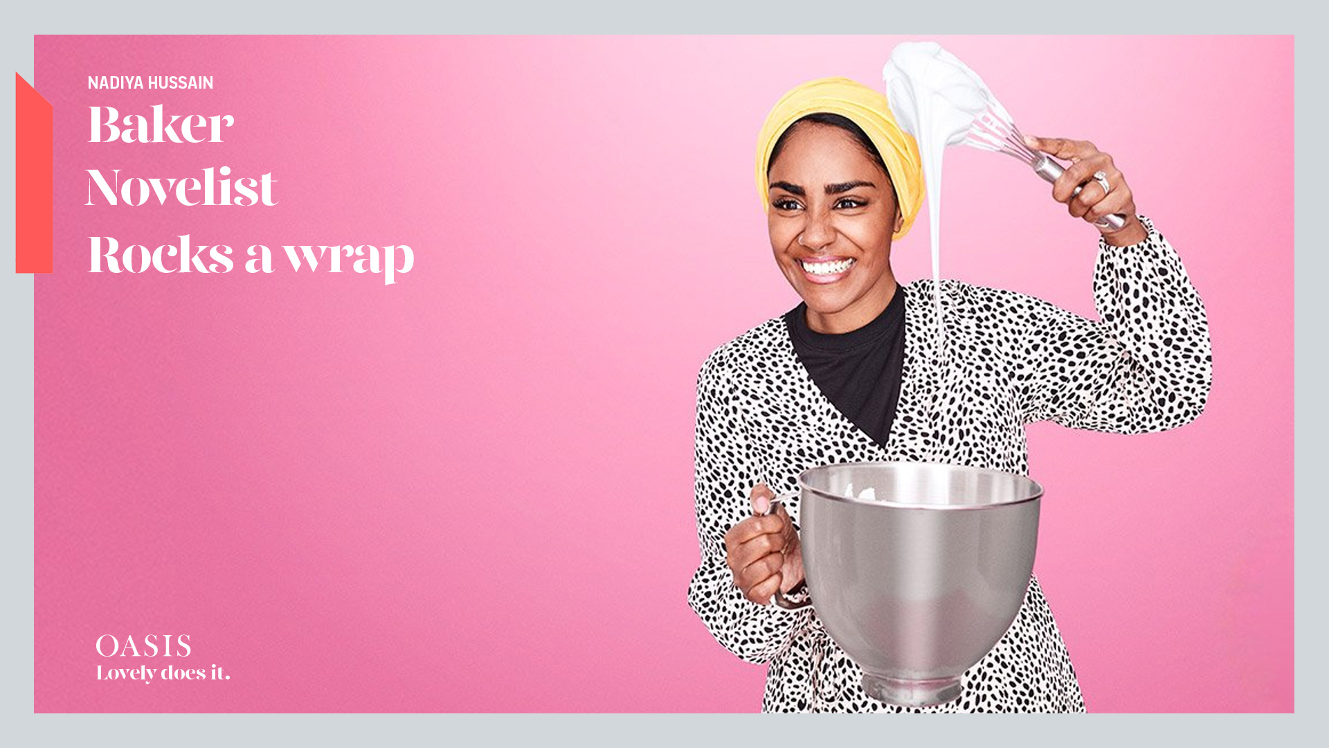
Kara Tointon, Katie Piper and Nadiya Hussain launch the Oasis Spring/Summer campaign in March. Each ambassador was chosen for her supercharged loveliness and aspirational embodiment of a modern, polymath woman. Photographed in action, with supporting copy to celebrate their varied achievements and hint at their style.
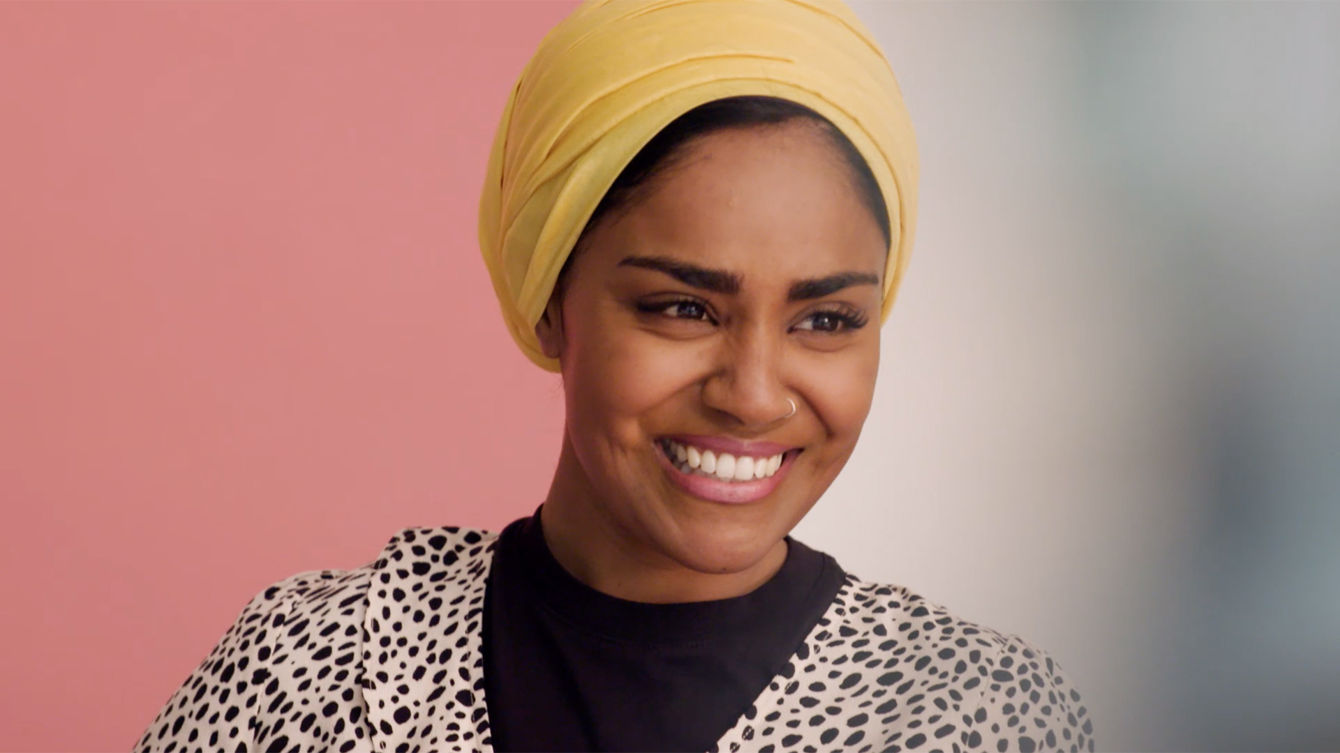
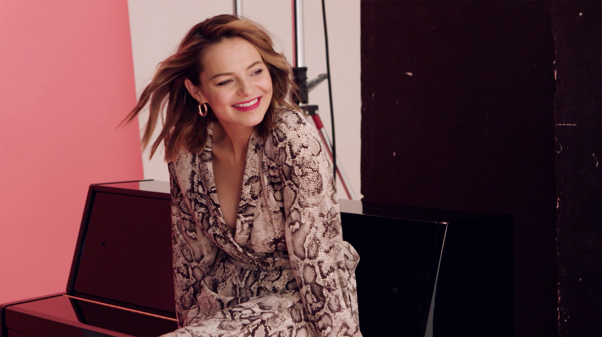
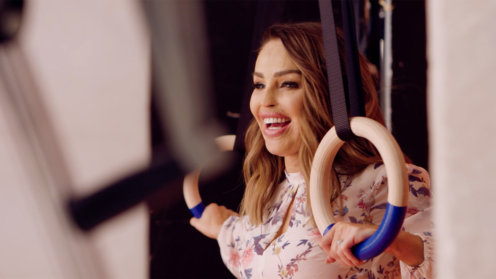
The campaign also includes a video content series, with Kara, Katie and Nadiya sharing their life and fashion To Do’s and To Dont’s.
A REFRESHED BRAND IDENTITY
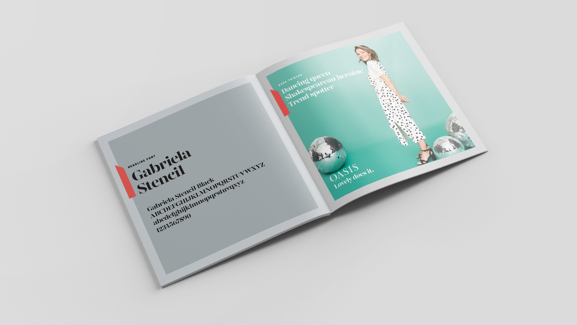
We tightened the rules around the logo marque and introduced impactful brand elements to increase stand-out on all communications. The hero brand colour, Oasis Coral, is two notches off the brand’s original pink, and is supported by a palette of sophisticated, cool greys.
Two new complementary fonts strike the perfect balance of loveliness: Gabriela Stencil for the brand voice, and digitally-friendly FS Industrie for body copy.
We also introduced additional brand properties to strengthen the Oasis visual identity: the ‘loupe’ draws the eye to product detail; the ‘tape’ introduces the brand colour and marks the brand tone of voice.
As part of the visual brand refresh, we also consulted on the application of the brand across social and digital platforms.
The result is a focus on the active side of the Oasis woman’s life, a new photographic and flat-lay style, and a new series of brand-led messages.
The work launched in March 2019.

