A refreshed brand identity to elevate and differentiate a TV brand from its more established sister network.
Owned by Crown Media Family Networks, and part of the stable that includes the cable behemoth Hallmark Channel, Hallmark Movies & Mysteries is a hugely successful US TV network targeting an audience of ‘armchair detectives’ who want to sleuth along with their heroes.
Its schedule is driven by original content, and specifically by its Sunday night Signature Mystery Series Franchise.
For the first time, the channel wanted its brand identity to focus entirely on its mystery USP and to lift Hallmark Movies & Mysteries from the shadows of its big sister network, Hallmark Channel.
PUTTING THE LOGO TO WORK
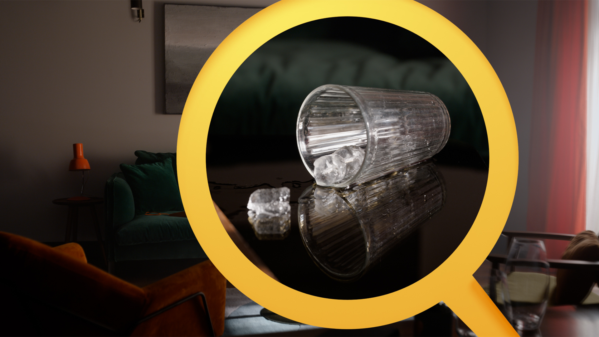
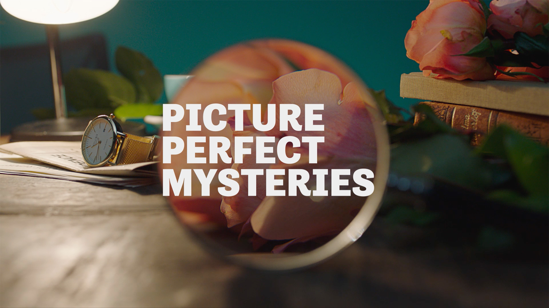
The logo was not changing, but it needed to become a more integrated part of the brand’s identity. We brought the magnifying glass front and centre, making it larger, bolder, more modern and dynamic. It became a simple visual shorthand for the channel, with an active role in the brand package, drawing the viewer’s attention and to find hidden clues.
A REFRESHED PALETTE
The Hallmark team wanted to create a distinct look across each and every brand asset. The new colour palette has pops of aquamarine, orange and yellow over deep, rich tones, bringing flexibility and standout to the brand toolkit.
IDs
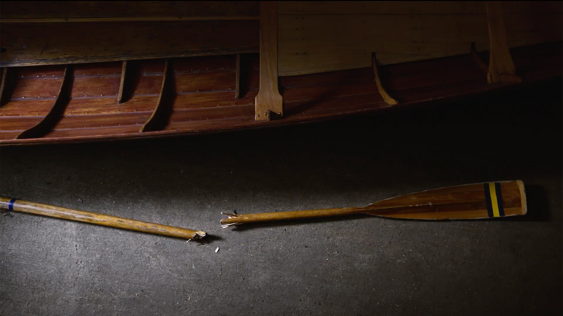
We developed and produced eight specially-shot IDs, each set in a different, compelling location and each intended to be a mini mystery in itself, with a level of suspense and intrigue. Audio ties the IDs together and introduces the brand’s lighter ‘whodunnit’ tone.
A BESPOKE LOOK FOR FLAGSHIP CONTENT
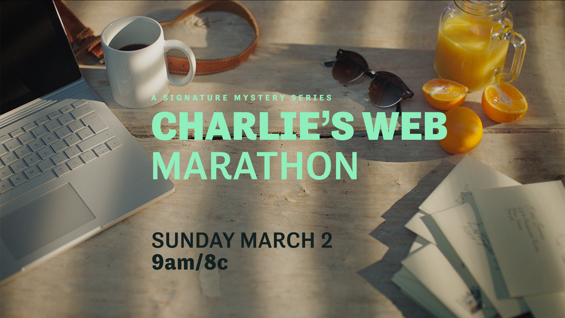
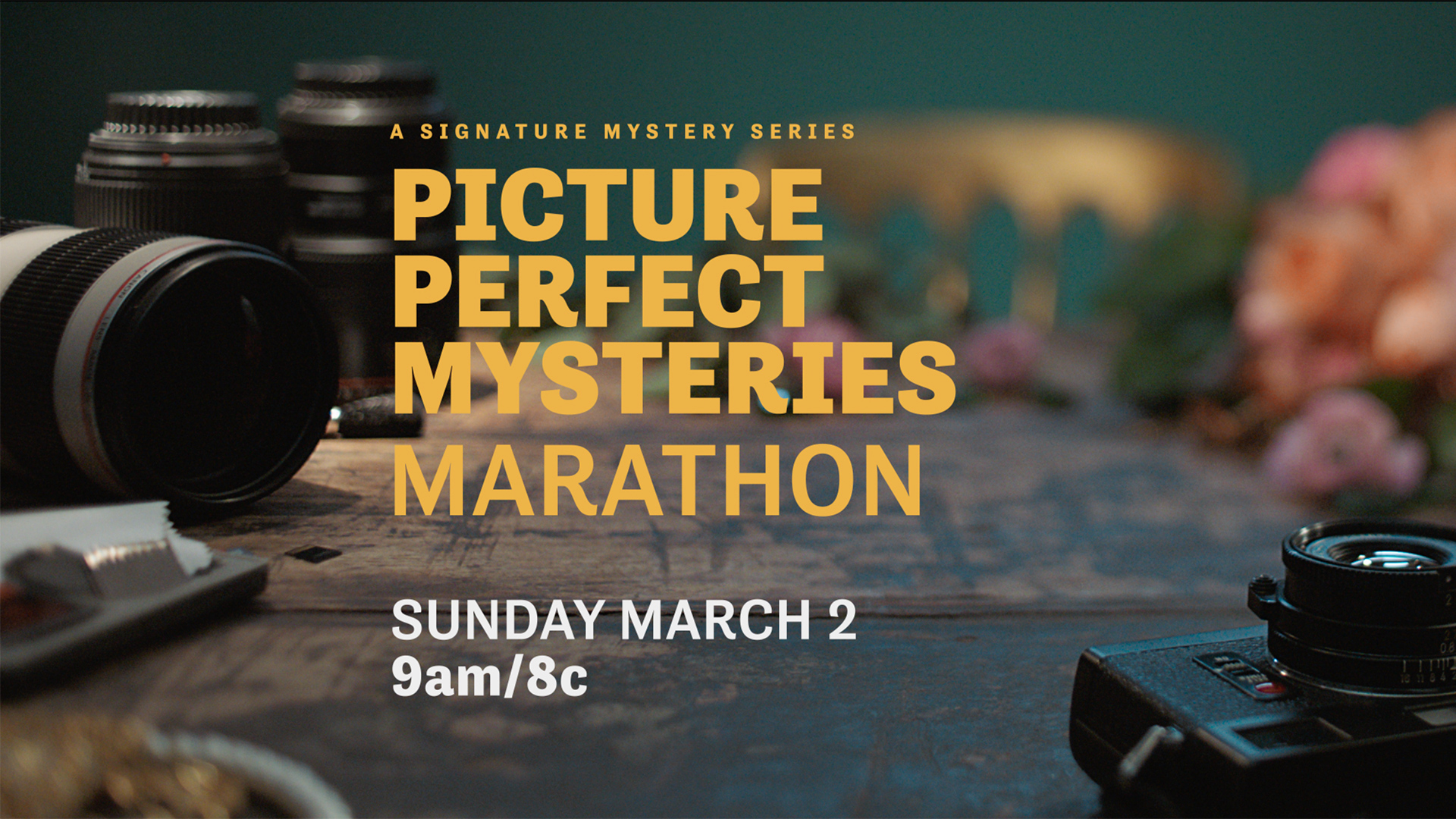
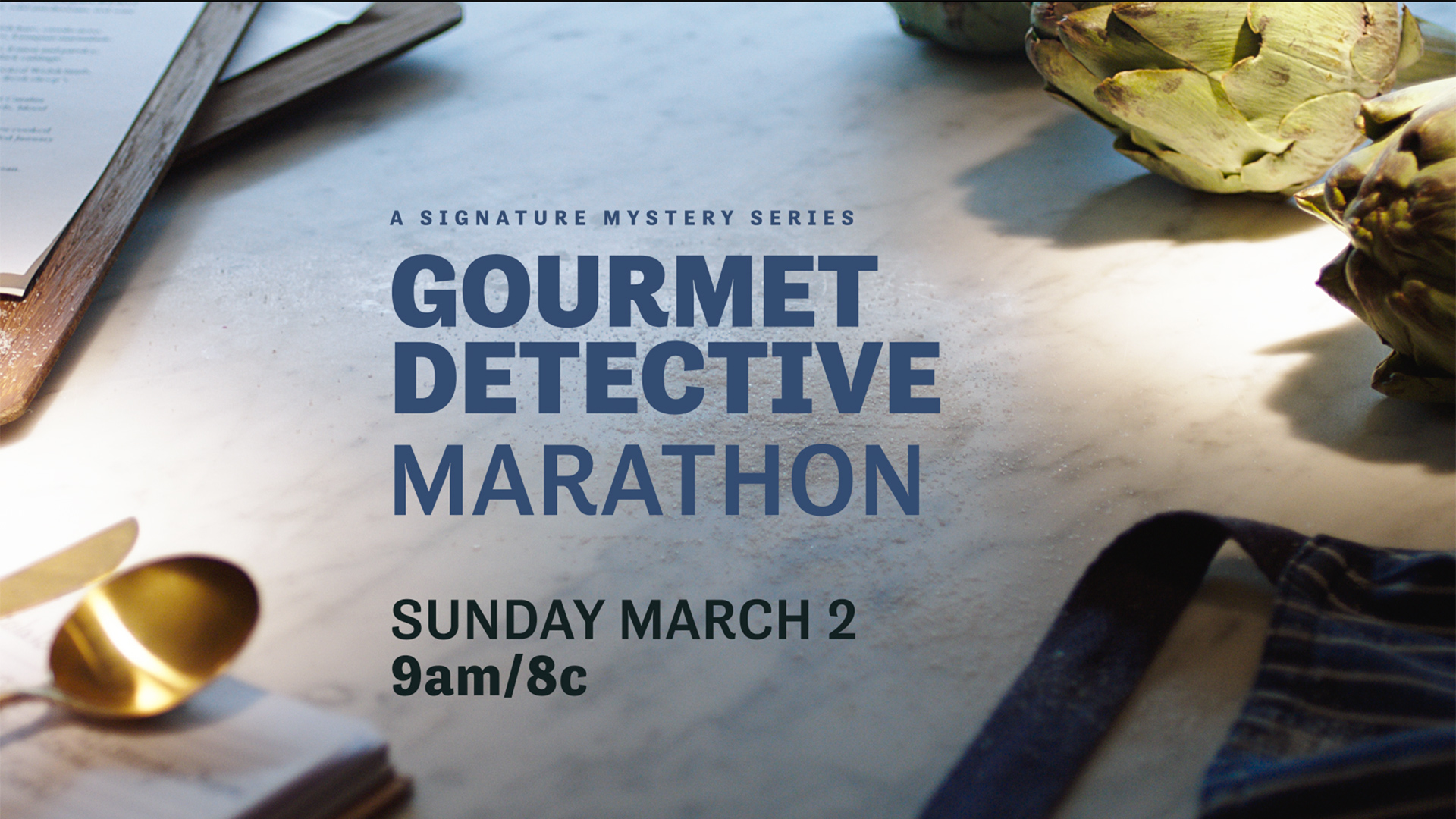
The network is renowned for its original content, including its Signature Mystery Series Franchise. We created specially-shot promo packaging templates for the 12 key series. Each one is a snapshot of that show’s hero sleuth and hints at the tone of the series through a layer of intrigue and mystery.
PROMO PACKAGING
The core network promos tie into key scenes and moments of the IDs: in each background image something in the scene is awry is picked out by the magnifying glass - a phone dangles off the hook, loose bank notes flutter from a leather bag, a dropped white glove in a pile of leaves.
A more graphic interpretation of the brand kit is used across other network content, with a clean background and singular application of the hero magnifying glass.

