
A new portfolio strategy and network design system.
When Discovery acquired Nordic broadcast network SBS it brought with it a few challenges. The Norwegian press reported the news harshly, leaving audiences with a negative impression of both brands and the motives for the union. Internally, the joint portfolio of channel brands was unclear and there was a general lack of focus in what the network brand stood for.
We were tasked with creating a coherent brand architecture for the newly merged company and a design system to bring the masterbrand to life.
We kicked off the process with a brand workshop to really get under the skin of the issues faced by the newly merged marketing teams. This was then followed-up by a series of interviews with senior stakeholders to agree core issues and to develop a working hypothesis for organisational structure and the brand’s values.
This result was agreement of an overarching positioning (‘discover the most complete world of entertainment’) and an outline network brand hierarchy.
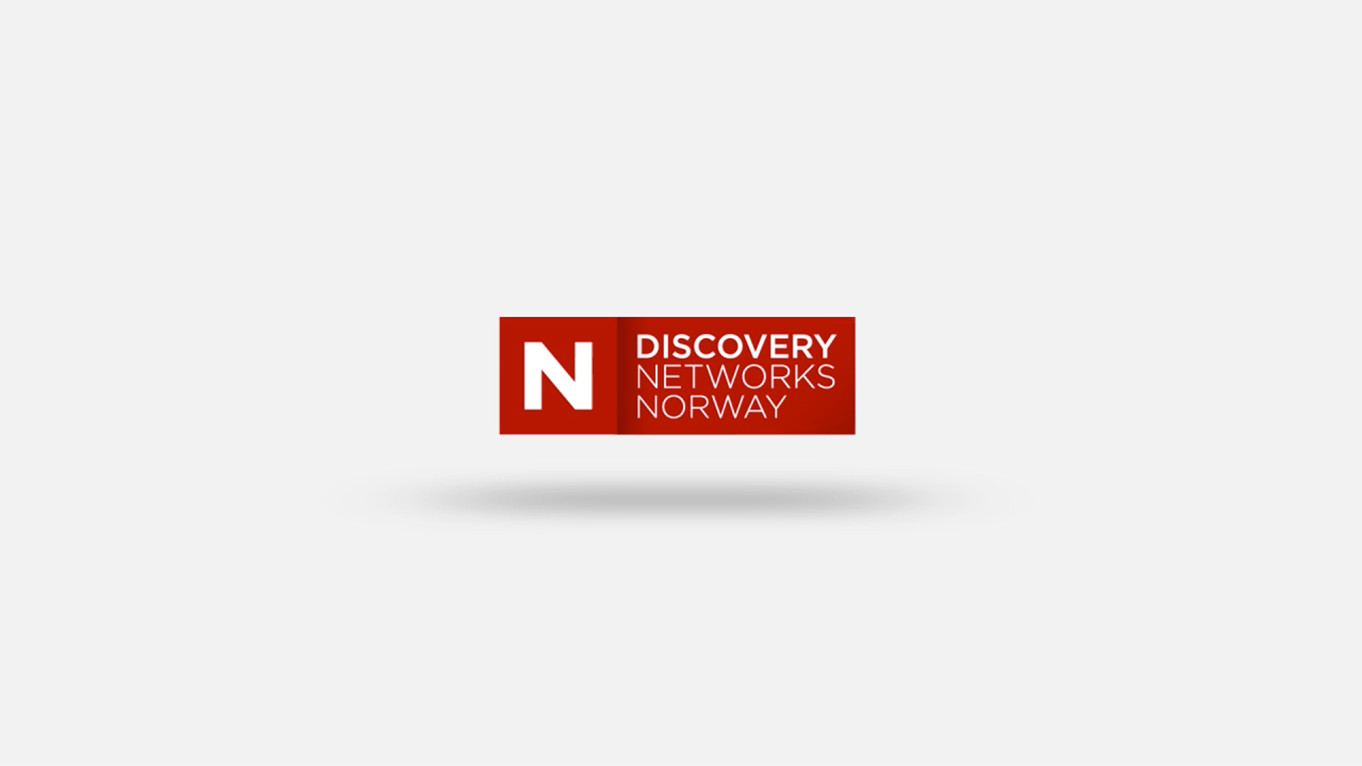
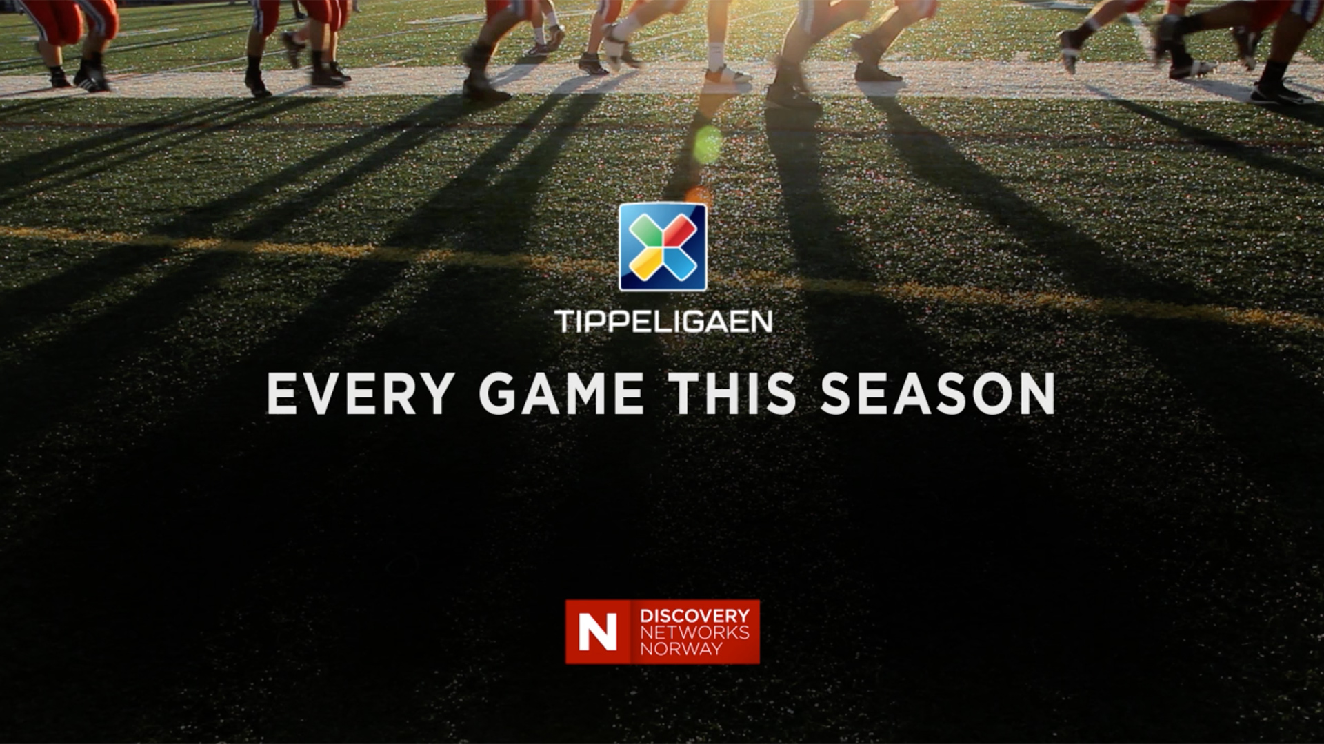
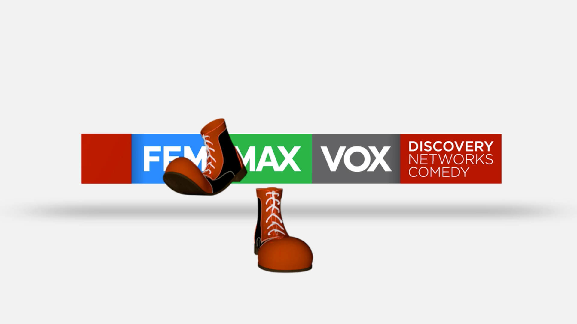
Armed with a clear portfolio positioning, we created an audience-facing masterbrand: Discovery Networks Norway. This included the creation of a network logo device to unite a disparate array of channels, VOD services, genres and audience experiences.
The key to the design solution was a flexible housing for the existing brand elements while still delivering a sense of brand personality. Taking our ‘Discover the most complete world of entertainment’ positioning as a starting point, we created a logo device that echoed a pair of red curtains like you might find on a West End stage – complete with an opening movement to reflect the ‘curtain up’ moment. The device was specifically designed to bring together all logo types and colours within a distinctive and ownable network look.

RESULTS
"Red Bee have been fantastic partners. Their strategic thinking, creative development and collaborative approach has been invaluable."
Rebecca Rormark, Discovery Networks Norway