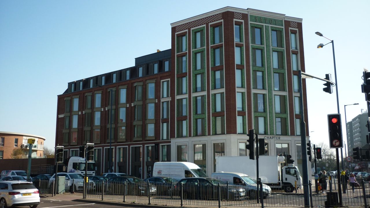
Two buildings have recently emerged on my short commute through Acton.
One striking in its embrace of outward style to complement a very utilitarian interior, the other which appears to have abandoned any attempt at external attractiveness in pursuit of functionality.
There is a lot of talk in television at the moment about content being king, and that as long as you have the rights to the best shows then it shouldn’t really matter how your channel brand appears to the audience. While a parallel with bricks and mortar might not be obvious, I think there is an important learning.
Let’s start with the villain. The David Lloyd chain of gyms and tennis clubs bought out a family-run West London institution – The Park Club, which for a couple of decades had occupied a building with wooden charm, an open façade and a profile resembling part cricket pavilion, part Swiss chalet.
The David Lloyd Group have taken that building, and turned it into something that now resembles a call centre on an out-of-town light industrial estate.
Perhaps they think it doesn’t matter – once you are inside the building, “the content on display”, whether the gyms, studios, swimming pools or tennis courts, will keep you coming back. But to the browsing observer and judged purely on the exterior, they have taken something premium and special and made it utilitarian and not worth paying more for than the local municipal swimming pool. External design affects value and always will.
Now to the hero, a new development of student accommodation built on probably the site with the worst feng shui in all of Greater London. A corner development with the roar of the Westway on one side and the gridlocked traffic of East Acton Lane on the other. I watched the building going up, with a set of pre-fabricated portakabins seemingly being stacked like a giant jenga set. The content is then, in TV terms, strictly formatted and predictable. But then the façade was added, with a joyous nod to grand art deco buildings like the Bluebird in Chelsea, a gleaming green tile frontage and smart revolving doors that herald more a Broadcasting House than a student digs. Then there is the name: with a nod to the site’s ancient history as the Savoy Cinema, it has become the Savoy Circus. Premium, desirable but crucially with an authentic story.
I want my children to live there, even if they are at the university in Hull. I would pay a premium for them to be boxed into that corner of what writer Edward Platt christened “Leadville”. The developers have placed desirability over functionality.
Recently I saw designer Stefan Sagmeister talk at the Promax US conference in New York, with his own cri-de-coeur for the power of beauty, and its relative absence from recent architectural trends. As he describes it, “the horror of economic functionalism”. Asking an audience to choose from 8 colours, the least popular was brown. Then repeating it with 6 shapes, the least popular was a rectangle. As Sagmeister then reveals, repeat this on a huge scale and you get the same result. So why has the standard architectural solution for the last 60 years been the brown rectangle? In media branding there are similar accepted tropes that should be challenged on just such a regular basis. The best examples from the last 12 months have all aspired to be more than just building the same shape on what went before. Whether that is SyFy’s striking rebrand by LoyalKaspar in 2017, Red Bee’s own crafted solution for crime channel 13th Street, or the smart UI of the new BBC Sounds app.
As we start to work with what the future of television distribution is, from OTT streaming services to protecting the shared viewing of linear channels, one thing we must never lose sight of is that, while function is important, beauty matters.
People pay a premium for it.
Charlie Mawer, Executive Creative Director

