Loading
In collaboration with CCMA, we created an exuberant and vibrant new channel brand for a much-loved but rather tired Catalonian channel, TV3.
TV3 is hugely proud to be Catalonia’s primary TV channel. Catalans are deeply proud and protective of the channel which is part of the fabric of their lives, from childhood to old age. But the channel’s image was a bit out of date and needed an update, so the TV3 team came to us for help.
TV3 wanted to retain the equity they had in their existing brand while also making a shift in their positioning to create a stronger connection with their audience. They also wanted to find a way to introduce the true Catalan nature – wise, yet impulsive – into the nation’s treasured TV brand.
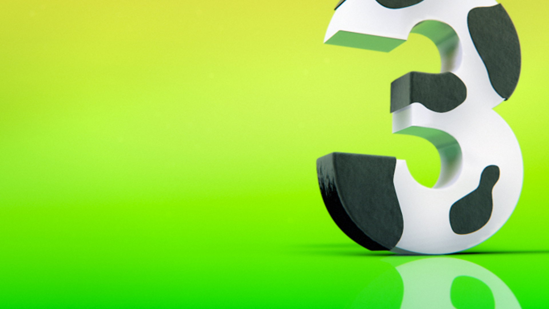
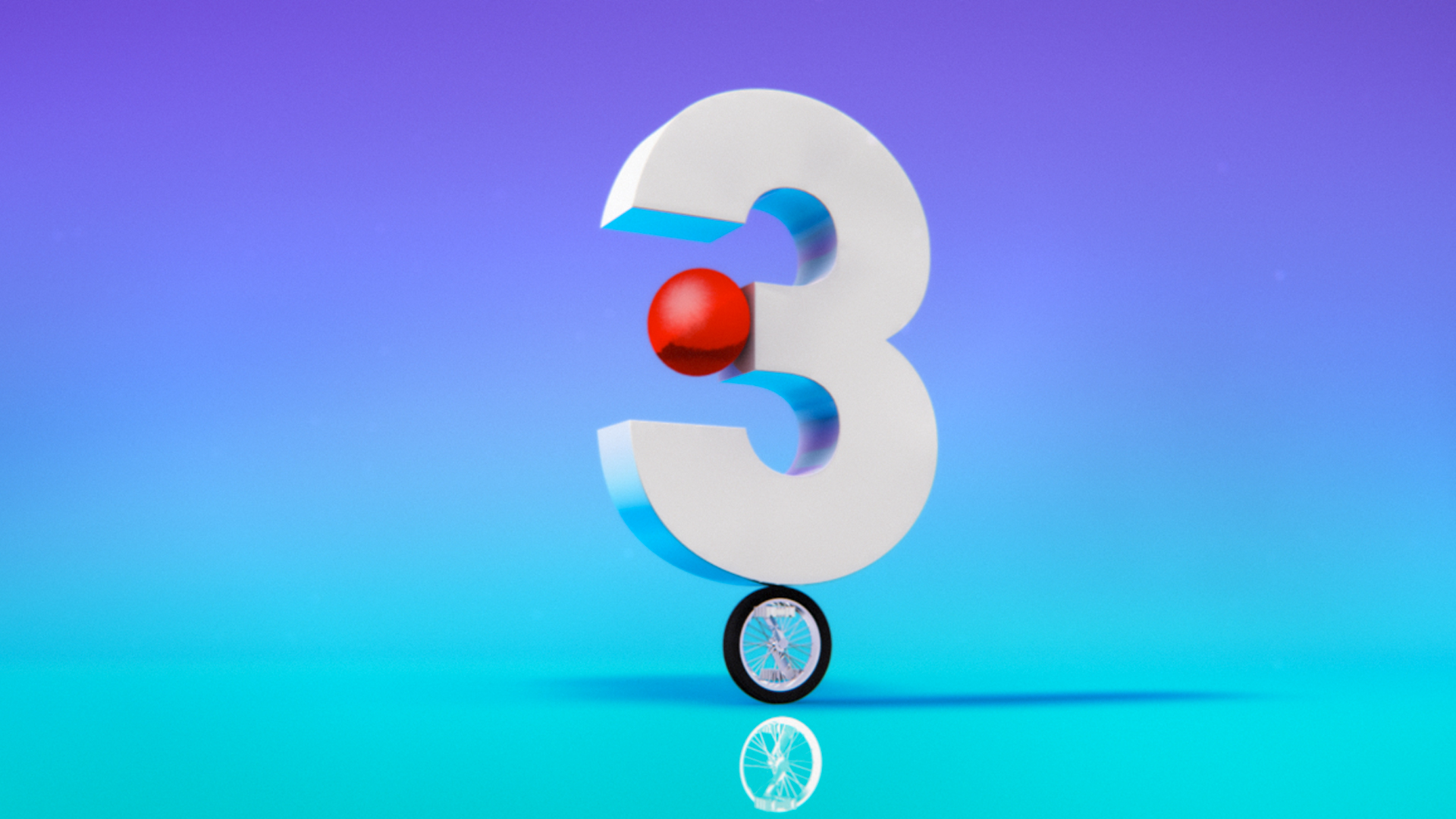
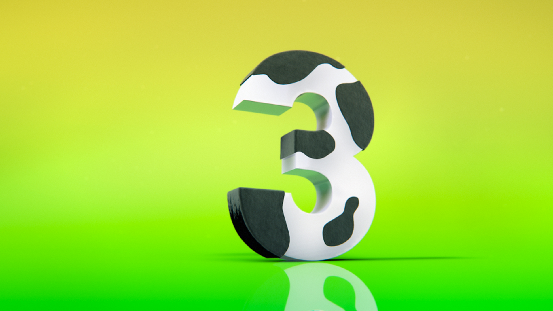
From the outset we were very clear that we wanted to find a solution that would embody the Catalonian spirit. We found our solution in the brand’s existing logo: the “3”, already a hero in the previous identity, was witty, charming and impulsive and was the obvious candidate to create a connection between the audience and the channel brand. Only our hero 3 could make sense of the combination of a fluorescent marker pen, an electric plug and a jellyfish.
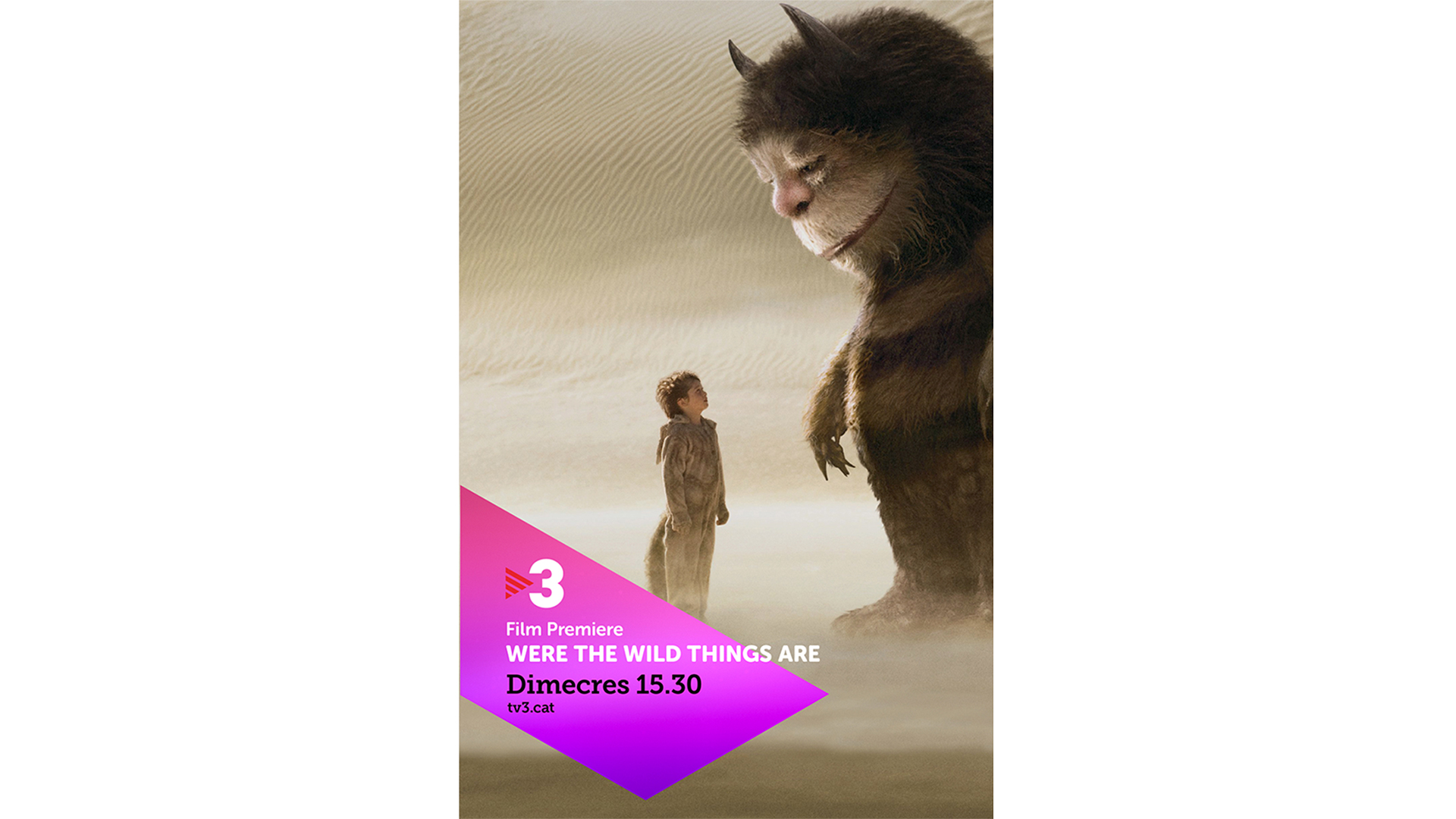
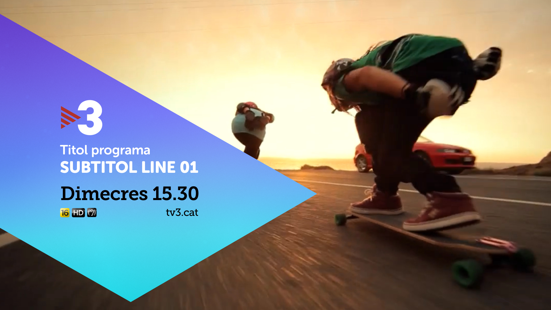
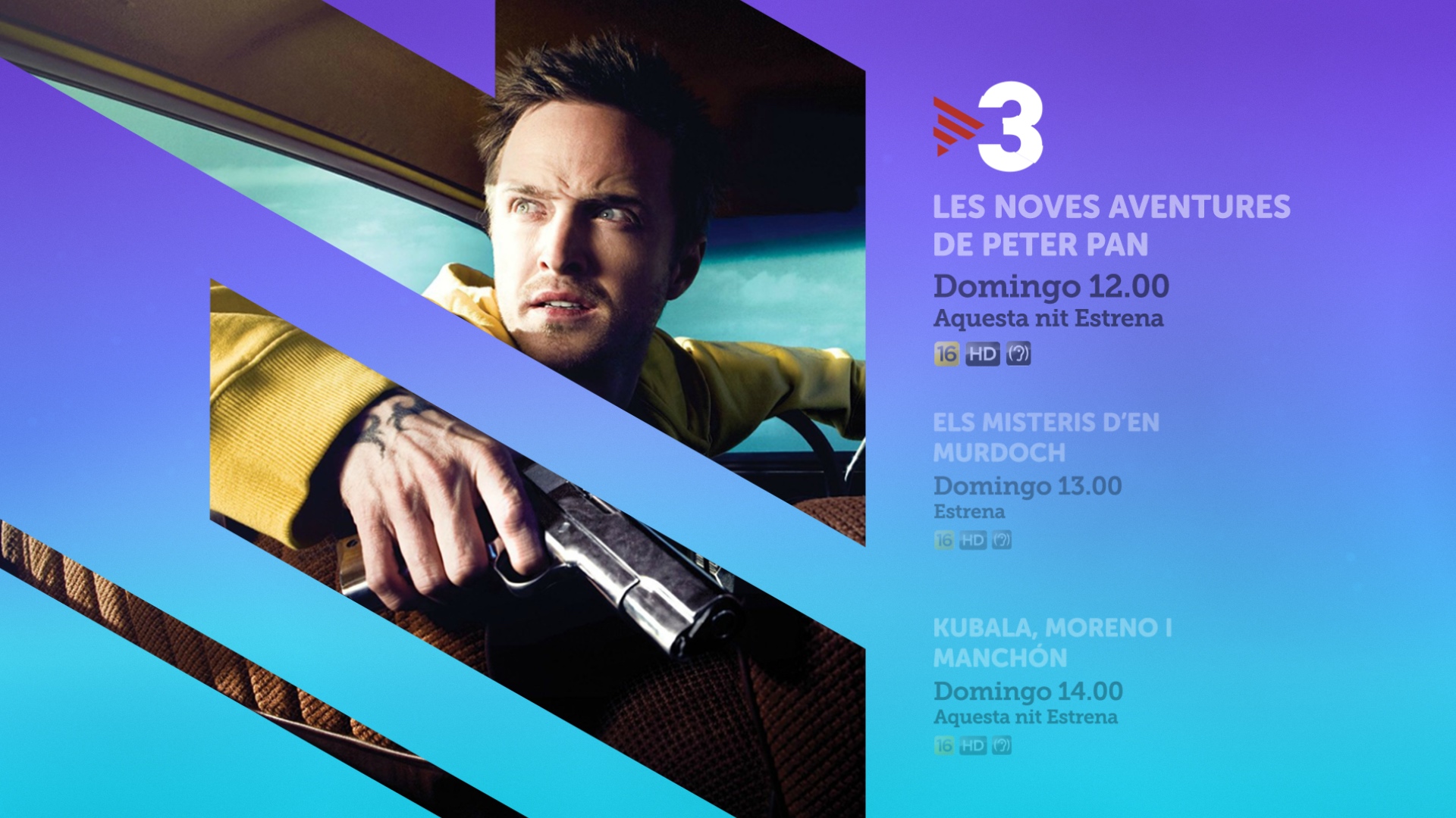
The second element of the TV3 logo is the iconic Triangle, an abstract of Catalan’s national flag. We gave the Triangle a more serious, steady and rational role as the backbone of the navigation graphics system and derived a 60 degrees angle from it to create an ownable brand movement that we use across promo openers, menus, IPPs and overlays to create a clean and stylish navigation system.
“It’s been a great pleasure to work with Red Bee in this project. They are wonderful people, and we connected with them the very first day. Regarding to work, I have to say that they understood perfectly what is our brand and what it represents to our audience. We have a new image that allows us to be, even more, who we are.”
- Daniel Reyes, Head of Marketing
We made a hero of the “3” from TV3's existing logo, using it exuberantly to make sense of three seemingly disparate but ultimately connected things.


The on-screen presentation, promotion and navigation drew inspiration from the triangle in the existing logo. We used the triangle and its distinctive construction of bars to create an ownable brand movement that could work across any screen.
The consistent angle of the triangle / bar device was carried through into print.